This was a talk Brett gave during the Visual Politics of Digital Ecologies conference at the University of Oxford in Feb. 2026.
This talk comes from ethnographic fieldwork that I had done with the noise observatory for the Île-de-France region in 2023. I was there to learn about how noise both becomes and does not become an object of knowledge amenable to government and intervention. This talk is about a central element of that: noise maps.
However, rather than treating these as digital visualisations that rend noise into its image as a “docile object” (Lynch 1985), or as constituting a narrow visual field of the State, I want to read them – to use a term from Natasha Myers and Carla Hustak – “athwart”, or “against the grain” (2012: 77-8), that is, to read the digital map analogically (and I will clarify what I mean soon). And, I want to do this by attending to a hesitation I have around the way noise maps relate colour and noise. Can colour – as an effect of a grid of pixels in the map – mimic the analogue experience of listening to noise that we call annoyance?
This is thus a talk about noise maps and listening visually, and of how analogies are mistakes that can also be true.
Noise Maps
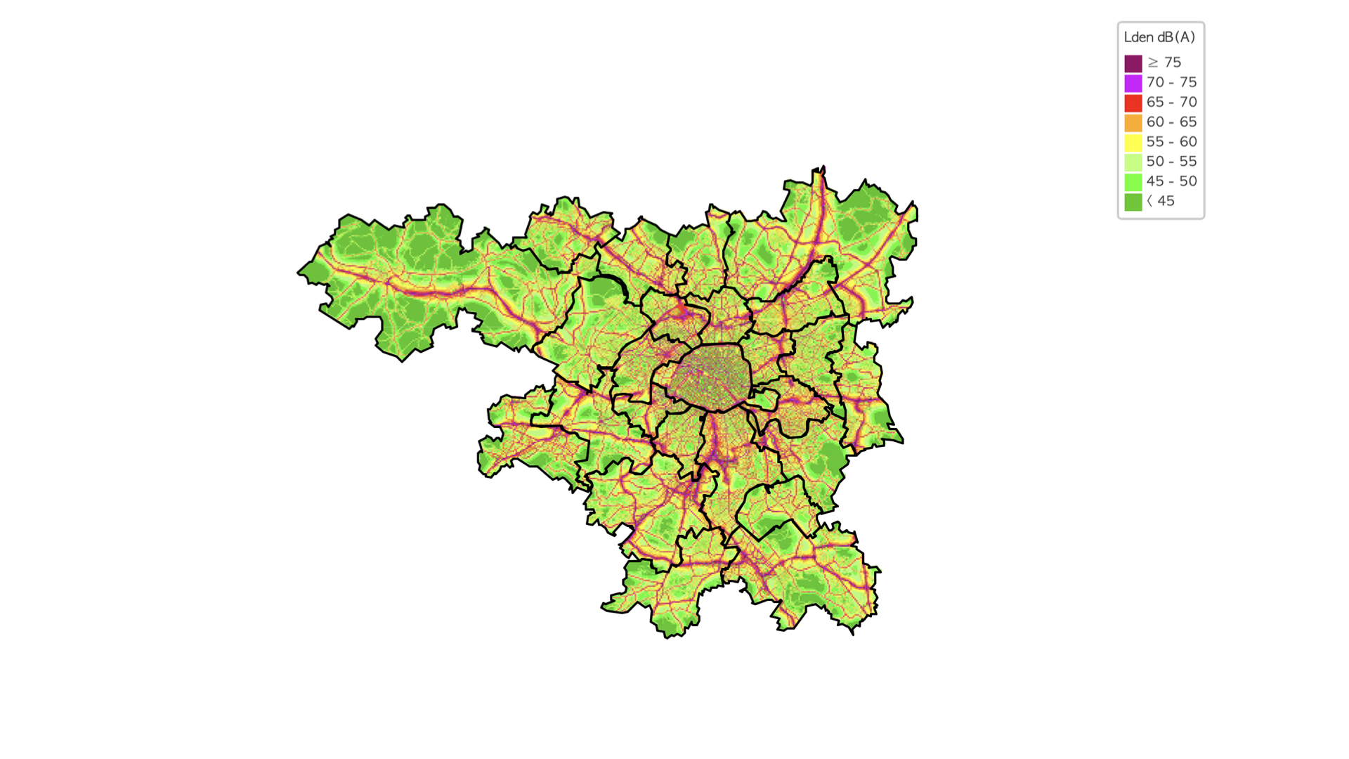
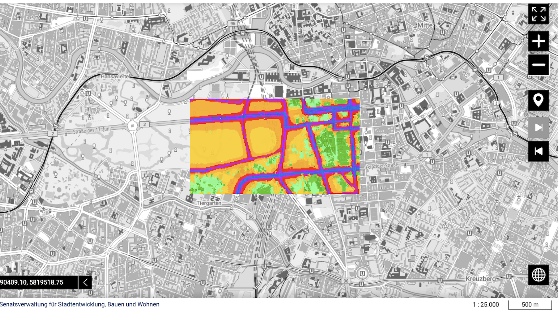
This is the noise map for the Île-de-France region. It is a screenshot taken on 15 Jan. 2026 from https://carto.bruitparif.fr/.
Noise maps have become the primary media in which environmental noise is known. In the EU, for instance, the Environmental Noise Directive obliges states to produce and submit new maps every 5 years. As a data visualisation, colourful noise maps are said to be useful insofar as they can give otherwise complex and abstract information a concrete perceptual shape. They are “intuitive” (see Tufte 1990).
This is important for knowing noise. Noise maps help put noise, otherwise indeterminate, relative, diffuse, ephemeral, subjective, (see Peterson 2021) etc., into an object-like shape. They, in other words, provide some reliability for what is otherwise an unstable or unreliable knowledge when based on the experience of listening to noise.
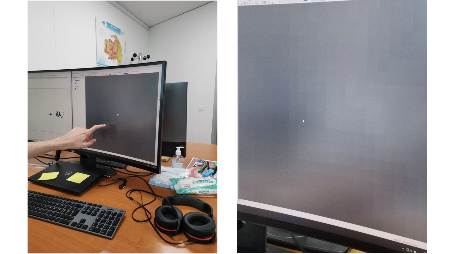
One morning at the observatory I meet Adrian. He is at work on ensuring this reliability by checking through the noise maps they have produced for the EU. As he clicks, staring at the screen, he tells me that noise maps are quite simple. They are not complicated. It is merely a calculation that uses provided data, parameters, and a standard calculation method. “The computer does it all,” he says modestly.
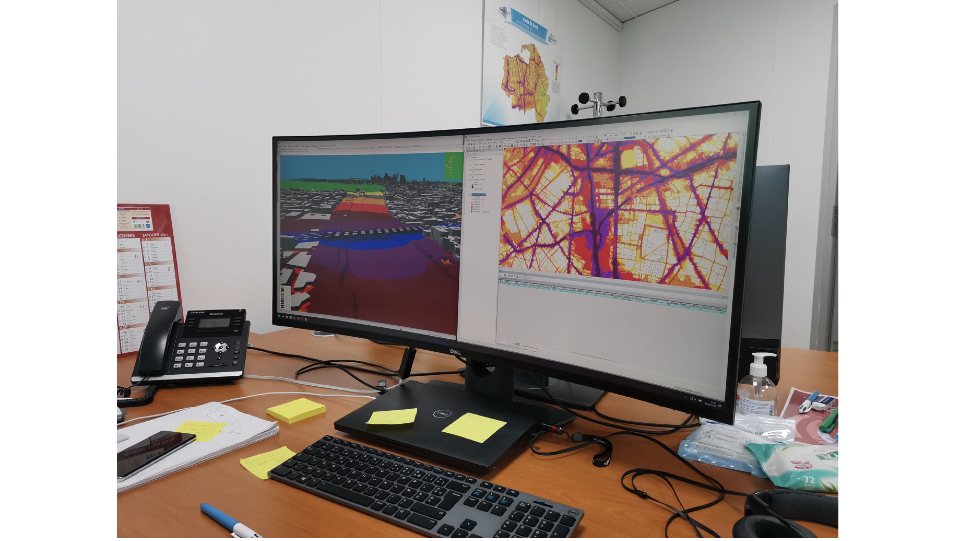
Mapping noise in the office of Bruitparif. Source: Author.
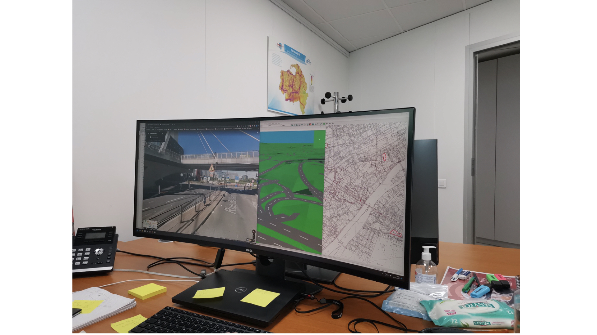
What is difficult though is finding the errors and ensuring the map, as he says, “is as close to reality as possible”. So he verifies that everything “lines up”: [slide 6] data, like traffic numbers, the parameters, like the absorption coefficients or the meteorological conditions; that the the GIS map and 3D model match up with the topography of the city. Noise maps are thus not based on the measurement of noise. Noise maps represent calculations of noise. He tells me that, for instance, it takes a lot of time for them to render these data into the visual object…
Three layers of the noise map — how to line them up? Source: Author.
In a way, he is comparing the three planes on the map, the colour of the noise, the flat GIS map and the 3D model.
The problem, Adrian tells me, is that the data they use is rarely complete and that there are mistakes. The Seine can flow over the bridge. The curves of the walls are not represented. The materiality of the city changes too frequently.
The maps themselves always seem to be wrong anyway. Residents are upset that they are in the yellow, and not the red. The average sound levels that the colours are based on only correspond to tendencies, not actualities. Politicians demand that the maps be changed before they can be approved.
So, while there is a “regime of visibility” instituted by the EU and based on expert working groups, standards, and technologies, through which noise can become visible “objectively”, it is also not entirely clear what they actually represent —
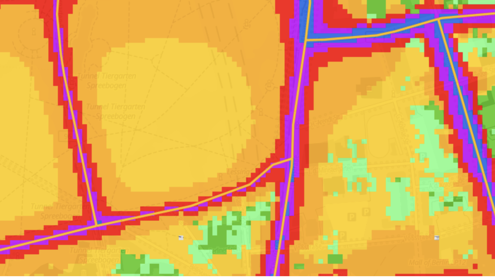
It all begins with the Pixel. Source: Author.
The most important element, Adrian tells me, is that the map is limited by the pixel and its grid. Each pixel corresponds to about 5 x 5 meters of “reality”. That is the way in which both the colour but also the noise appears: the resolution is how close the map can get to an experience of noise.
The digital and analogies in Deleuze’s On Painting (2025)
So, in what follows, I want to talk about this relation a little as a kind of analogy – that is, how the digital noise map works analogically.
But first, I want to quickly unpack how the philosopher Gilles Deleuze talks about the digital and the ana-logic in painting.
Deleuze’s definition of the digital is quite common. The digital is based on a code that articulates something. Digitisation, for instance, is the process in which something is encoded, put into discrete units that refer to elements tied up in in binary relationships. For instance, the pixel-grid used in the noise map. That’s digital, codelike. Black is 00. White is 11.
For Deleuze, the digital is based on an articulated language, a binary code, whereas the analogical draws attention to what could be a non-articulated language. He defines three types of analogy.
There is, first, the “common analogy” based on similitude. A mold transfers its structure onto clay to make a brick. The electric signal fluctuations that imitate the vibrations of a voice in an analogue telephone line. There is a similitude, a similarity of structure, between voice and signal. Two things are compared through a resemblance. That’s what a common analogy is.
But he is more interested in the other two types.
For instance: an analogy of relations. This is not based on similitude. For instance, he writes, What does it resemble when your hair stands on end? Fear? When you are blushing? Embarrassment? There is an analogical relation between them but no similitude.
[An aside: see also Simondon (2020) on analogy. He makes a distinction that is relevant here between rapports of identity (relations based on identity) and identity of rapports (or an identity that is produced based on relations). The former is akin to the common analogy based on similitude. The latter opens up into these other non-similitude ideas of analogy in Deleuze.]
There is also what he calls an “Aesthetic Analogy” and this is his definition of painting. Painting is the modulation of colour or light that produces a resemblance or an image. It is an analogy that produces, in his words, resemblance though non-resembling means. By modulating the intensities of colour an image emerges, a representation, not based on similitude. For instance, depth emerges through a play of colour, or their intensities and tones, like the greens of Cezanne’s trees.
Another way to approach this is that these last two types of analogy indicate that the non-articulated can generate a representation. For example, the way in which within articulated language there are tones, gasps, murmurs, etc., that nevertheless produce meaning.
In painting, colour is a non-articulated force – like tone of colours – that is modulated to produce a resemblance. It works as an aesthetic analogy.
Now, I want to try to bring this to speak about how digital noise maps may also work analogically.
A Colourism of Noise Maps
In noise maps, like most visualisations, colour is important. It is understood in a digital way, for instance, to “encode” information to represent patterns otherwise illegible within data.
But it can also work analogically.
An article on colour in noise maps, for instance, underlines this: colour, the author (Weninger 2015: 441) writes, “represent[s] a physical value or a thread that emanates from the presented value, such as health risk or annoyance”. This is a really wonderful description: a thread that emanates… I read this to say that colour analogically represents annoyance as it “emanates” from it. Colour provides intuitive access to this experience of noise.
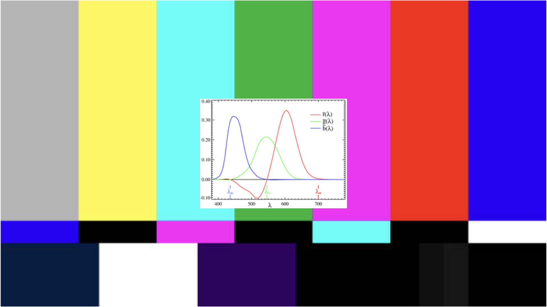
Colour Problems. At centre is the “standard observer” for the RGB colour space.
While there are standards to guide how colour should be used in noise maps, there are also caveats highlighting the problems of colour. How it is relative, contingent upon culture, sensory and perceptual differences, or on computer screens, software and printer ink, that the RGB colour space is not best model for how humans see, etc.
[As an aside: The RGB colour space, which has become the standard for technical versions of seeing, is based on what is called a “standard observer” (see graph with the “Tristimulus curves”) that emerges from two experiments in the early 20th century by two British Scientists (J. Guild and W. Wright); the standard adopted by the CIE is thus based on 17 human subjects. For a history of the politics of the construction of colorimetry, see Johnston 1996).]
[As a second aside: there are many discussions by acousticians and noise experts regarding the difficulty of using colour in noise maps. See Weninger 2013, e.g. There has also been various critiques of the RGB colour space as the standard for scientific visualisations, which critiques of RGB for noise maps often draw upon].
In other words, like noise, these colour problems arise, in a way, due to the unreliability of colour as a percept.
Analogy 1
This also indicates a kind of recursivity, or loop, in noise maps whereby the analogical is grafted onto the digital. That is, if noise maps aim to “digitize” the experience of listening to noise as annoyance through discrete units and pixels in grids as a code, another layer emerges insofar as the pixel grid, the colours, are used to analogically relate to noise and annoyance through the sensorially and perceptually unstable experience of colour. There is a kind of “perceptual mimesis” (Zhang 2020) or analogy. The perceptual experience of listening emanates from the perceptual experience of colour. That’s what makes it intuitive.
In her ethnography of airport noise, Marina Peterson (2021: 71) writes how the “perception of sound becomes perception of the map, which yields its own vitality and vibrancy”; in the noise map, sound and image are “immanent in perception” (2021: 71). Listening and seeing become co-extensive. But, she says this in order to draw attention to the instability of noise as an object of knowledge: even when put into a visual form in the map the instability of perceiving noise returns through the instability of perceiving colour.
In other words, the noise map brings two sensory registers together, “immanently”. It both works and does not work because of this.
Peterson does not describe it as an analogy. But you can read it this way. Noise maps bring together disparate sensory registers that sit together in disjunction, in tension. They represent noise not as an “object”, but as an unstable analogical relation between different sensory registers.
Analogy 2
But you can also say that there is no similitude between them. A sound wave is not structurally similar to electromagnetic waves. The visual is not structured like the audible. Seeing is not like Listening. Noise is not Colour. However, something is produced in this non-coincidence between them. This is something that you might even call wrong. Or, following the poet Anne Carson, poetry.
In her poem, “Essay on what I think about most”, Carson writes that what is done in poetry, by bringing together what should not go together, is error. Her words: “The wilful creation of error”. Poetry exists suspended in a hesitation around a difference between the disparate. Like painting, it produces a resemblance not based on similitude. It draws together what should not come together. This is how it works analogically. Poetry is to spend a moment with what Carson calls, in reference to Aristotle, the “true mistakes of metaphor” (or analogy), like, for instance, the true mistake of noise maps, of listening visually, or the colour of noise.
This is what the analogical affords us: to be suspended within a difference or ambivalence that makes us hesitate. Or, at the very least, as Carson (2021) writes: “To arrest the mind in its headlong rush for certainty may teach us something unexpected”.
References
Carson, Anne. 2000. “Essay on What I Think About Most”. Men in the Off Hours . Vintage Books.
Carson, Anne. 2021. “Stillness”. Critical Inquiry 48 no. 1: 1-22.
Deleuze, Gilles. 2025. On Painting . Edited by David Lapoujade. Translated by Charles J. Stivale with the Deleuze Seminars Translation Collective. University of Minnesota Press.
Johnston, Sean F. 1996. “The Construction of Colorimetry by Committee”. Science in Context 9: 387-420.
Lynch, Michael. 1985. “Discipline and the Material Form of Images: An Analysis of Scientific Visibility”. Social Studies of Science 15 no. 1: 37-66.
Myers, Natasha and Carla Hustak. 2012. “Involutionary Momentum: Affective Ecologies and the Sciences of Plant/Insect Encounters”. d i f f e r e n c e s : A Journal of Feminist Cultural Studies . 25 no. 3: 74-118.
Peterson, Marina. 2021. Atmospheric Noise: The Indefinite Urbanism of Los Angeles . Duke University Press.
Simondon, Gilbert. 2020. Individuation in Light of Notions of Form and Information Translated by Taylor Adkins. University of Minnesota Press.
Tufte, Edward. 1990. Envisioning Information . Graphics Press.
Weninger, Beate. 2013. “The Effects of Colour on the Interpretation of Traffic Noise in Strategic Noise Maps”. ICC, 2013: Dresden Conference . np.
Weninger, Beate. 2015. “A Color Scheme for the Presentation of Sound Immission in Maps: Requirements and Principles for Design”. EuroNoise 2015 . 31 May – 3 June, Maastricht. Conference Proceeding. 439-444.
Zhang, Dora. 2020. Strange Likeness: Description and the Modernist Novel . The University of Chicago Press.